

THEY say you can’t judge a book by its cover, but I certainly hope you can in my case. In my humble opinion, my cover designer Jane Dixon-Smith has excelled herself with Spark Out, the second book in my Boxer Boys series.
Jane, one of the members of the prolific author-collective Triskele Books, has a simple but effective way of working with authors and her covers can rightfully take their place alongside the very best on the virtual bookstand (or, indeed, in book shops if you are lucky to find anyone prepared to stock your book… hint, hint Waterstones, WH Smiths and Foyle’s).
It’s all about genre, really. Jane asks you what type of book you have written and invites you to submit covers you like in that genre. Once you have provided some examples and explained the kind of imagery best fits with your story, she sources them and sends you a variety to choose from. Once you have done that she then gets to work.
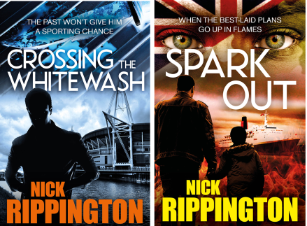
Crossing the Whitewash was my first book and because Spark Out is part of a series Jane wanted to stick to the overall style. As you will see the name is very similar as is the idea of taking a silhouette image, in this case a man and a boy, and adding a background significant to the story. For Crossing the Whitewash we used the Millennium Stadium, for Spark Out it’s the QE2, which carried 3,000 troops to war in the Falklands back in 1982.
For me, the image of a soldier’s eyes, facepainted with camouflage and the Union Jack, was striking, and we used it above the title in the same way we used the knife in the first book.
So that’s it. I hope you like it.
The book has just come back from my American Editor, more of which later, and is now with my wife Liz, a qualified proofreader. I will soon be selecting Beta Readers to get a free copy of the book and give me their comments while hopefully posting a review on Amazon or Goodreads on launch day. If anyone is interested please let me know via the comments on here and I will get back in touch.
